
Appearance
Page Designer: build screens
Concepts
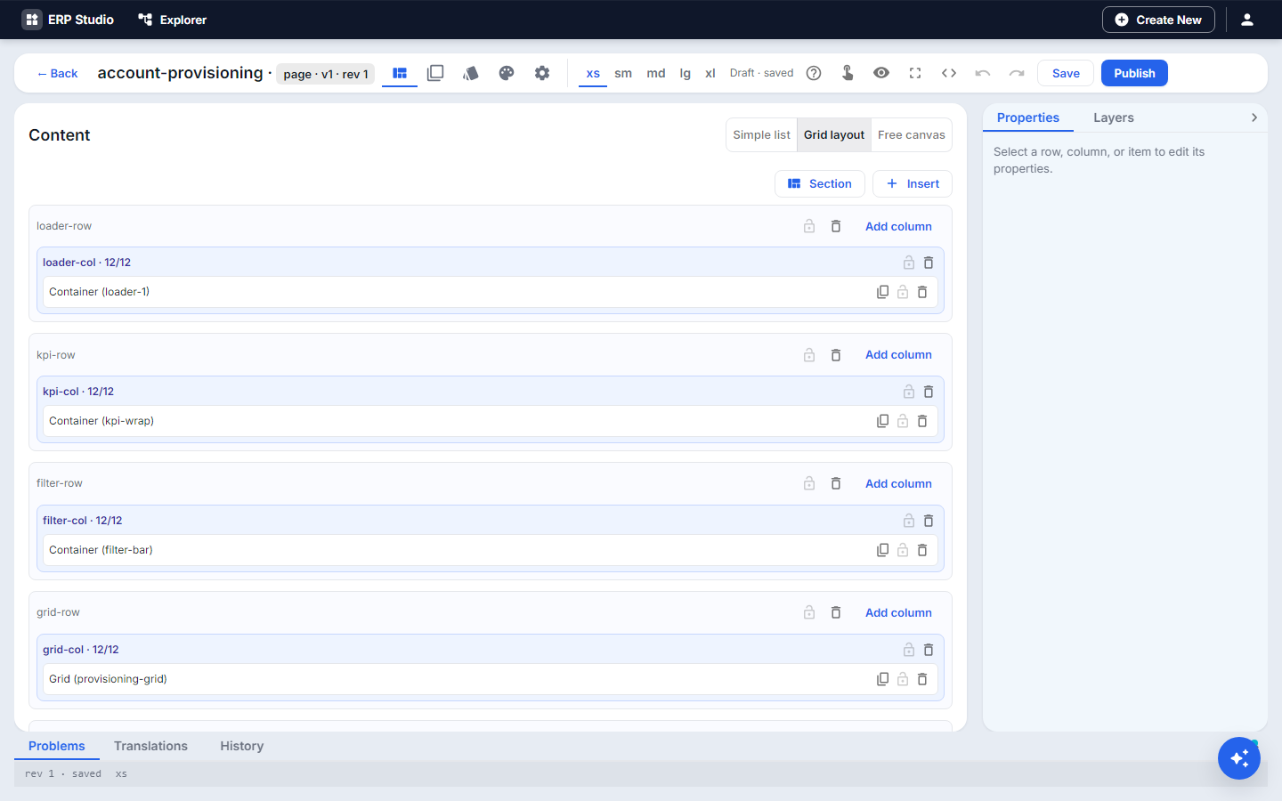
A page is a routable screen (/loans). It is a stack of rows; each row has columns; each column holds items. An item is a block (a table, chart, text, button), a form, or a link. There are always exactly three layers (row, column, item); anything deeper belongs inside a block.
Key ideas:
- Mobile first. You design the phone layout; larger screens (tablet, desktop, wide) add changes on top of it.
- Blocks are the building units (Studio never calls them widgets). A block has properties (each from a static value, a binding or an expression) and events (click, select) you wire to actions.
- Route with parameters:
/loans/:idshows one loan. A required parameter must be in the path; an optional one is a query string. - Access:
public(anyone) orauthenticated(signed-in). - Overlays: modal and drawer surfaces opened by an action.
- Variants: a different arrangement chosen by role or device class.
- Theme per page and Template (a reusable skeleton with slots).
Problem statement
The Lend an item form and the loans data exist, but users need one place: today's overdue items at the top, the list below, and a button to lend something. That place is a page.
What you will build
A Loans page: a KPI row (Out today, Overdue), a table of loans with a Status filter, and a Lend an item button that opens your form in a drawer.
All features
- Page rows outline and Layers; drag to reorder; multi-select.
- Blocks palette (the block catalog: tables, charts, cards, inputs, text, media, navigation) plus Forms and Link items.
- Live canvas with a layout breakpoint switch, and Detach layout to give one breakpoint its own arrangement.
- Live edit sidebar (edit text and properties in place).
- Free canvas placement by position and size, for special layouts.
- Settings: route and parameters, title, access, menu placement (area, group, label, icon, order), breadcrumb.
- On load: actions that run when the page opens (fetch data, set variables).
- Overlays (modal / drawer), Wizard steps for step-by-step flows.
- Template and variants, including variant layout overrides.
- Theme selector (platform default or a theme of yours) and preview locale.
- Visibility expressions on rows, columns and items ("show only for managers").
- Deferred rows that load only when scrolled to or activated.
- Problems tab, autosave, History with restore, JSON tab.
- Customize on plugin-shipped pages (layered overrides).
- Generate with AI from the Pages list.
Step by step
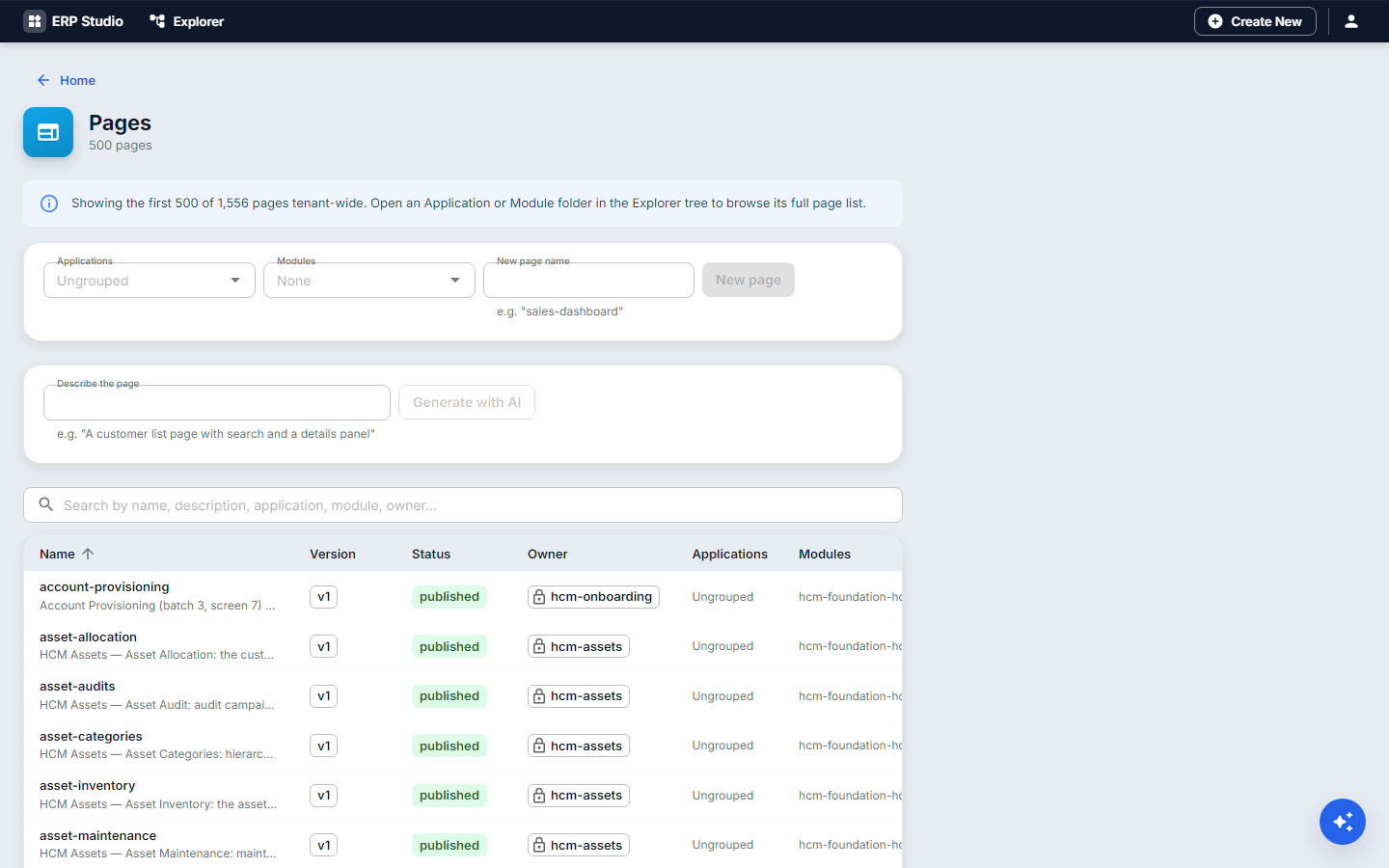
- Pages, New page. Title Loans, route
/loans, access authenticated. - Add a row with two columns. In each, drag a KPI card block. Set the value binding to a data view count (see Data services and views): Out today and Overdue.
- On the phone breakpoint, confirm the two cards stack; on desktop set each column to half width. (Side-by-side cards need each column's own width at larger sizes.)
- Add a row with a Data table block. Bind it to the loans data view; add columns Item, Borrower, Due, Status.
- Add a Select block above it, bound to a variable
statusFilter; make the table's filter use that variable. - Add a Button block "Lend an item". Wire its click event to the action open dialog with a drawer overlay.
- In Overlays, add the drawer and place your
lend-equipmentform inside it. - In Settings, put the page in the menu: area Operations, group Equipment, label "Loans".
- Open Problems; fix anything listed.
- Publish and open
/loansin the tenant app.
Check it worked
The route loads, the filter changes the table, the button opens the form, and the page appears in the menu for permitted roles.
Common mistakes
- Required route parameter missing from the path.
- Cards not side by side on desktop: give each column a width at the larger breakpoint.
- Editing a plugin-shipped page directly: use Customize.
- Hiding a block with visibility but expecting it not to load: it still mounts; use a deferred row for heavy content.
Next
Menus and navigation, so users can find it.