
Appearance
Dashboard Designer
Concepts
A dashboard is an interactive screen of KPIs and charts. It uses the same rows / columns / items layout as a page, but leans on chart blocks: KPI card, gauge, sparkline, pie, donut, radar, heat map, bar and line. Charts draw with Apache ECharts.
Filters are ordinary inputs (a select, a date picker) writing to page variables that charts read. Drill down is a chart's click event wired to a navigate action. There is no built-in auto-refresh; add a periodic action if you need one.
Problem statement
The facilities head wants one glance: how many items are out, how many are overdue, which categories go missing, trend by month.
All features
- Layout canvas with breakpoints, KPI and chart blocks, data binding to data services, filter inputs, drill-down navigation, permissions like any artifact, versioning and History, JSON tab, Problems.
Step by step
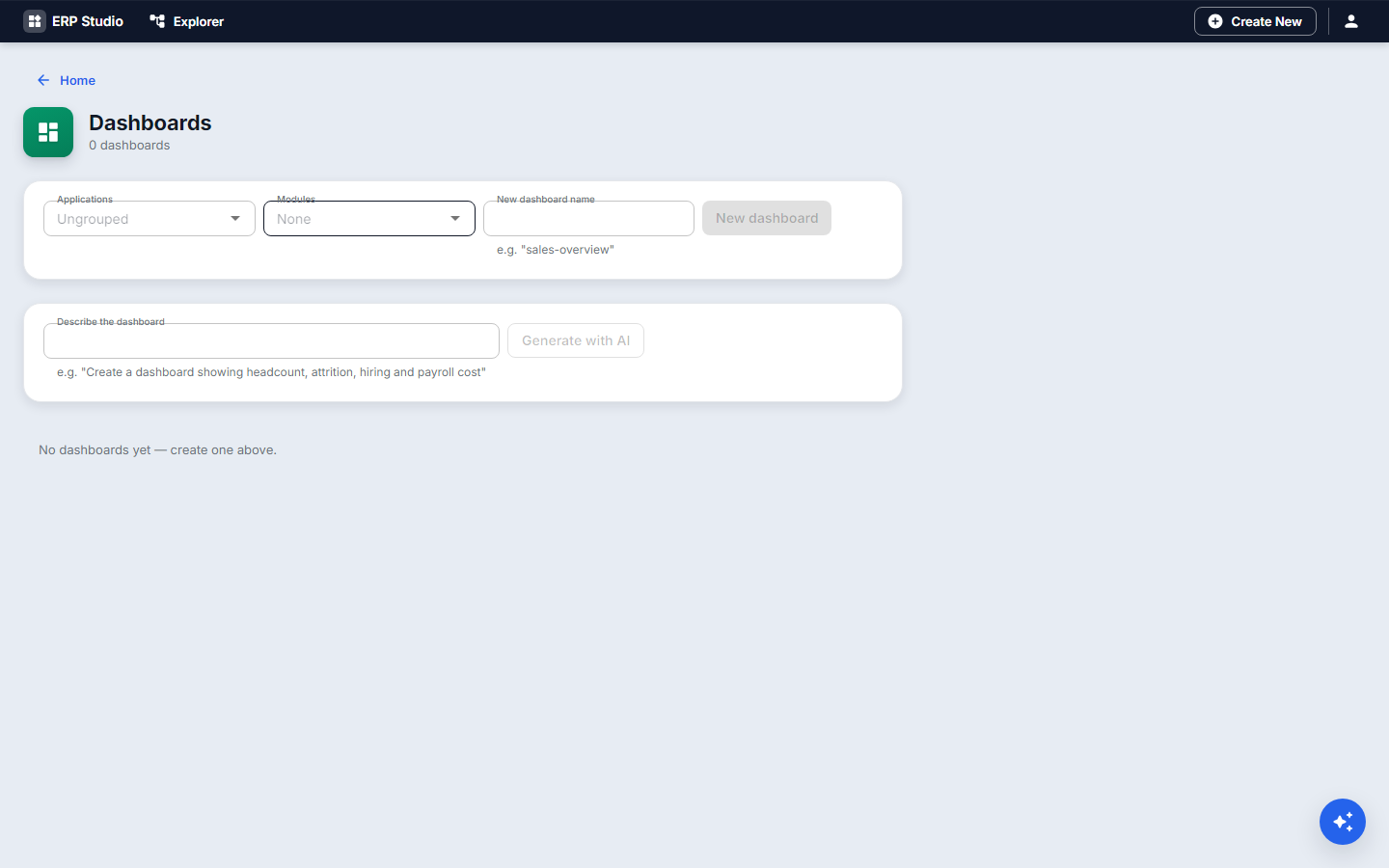
- Dashboards, New
equipment-overview. - Row 1: three KPI cards bound to
loans-out-count,loans-overdue-count,loans-lost-count. - Row 2: a donut chart bound to a composite service grouping loans by category; a line chart for loans per month.
- Above them, a date range input bound to
period; make the services acceptperiod. - Wire the donut's click event to navigate to
/loans?category=<clicked>. - Check the phone layout; Publish; add it to the menu.
Check it worked
Changing the period changes every number; clicking a slice opens the filtered list.
Common mistakes
- Numbers that differ between cards: they use different filters; share one composite service.
- Expecting live refresh.