
Appearance
Blocks
Concepts
A block is the unit that pages and dashboards are made of: a button, a data table, a KPI card, a chart, an approval panel. The platform ships a catalog of over a hundred (core.*). You can also make composite blocks of your own by combining others, and share them tenant-wide.
A block has properties (each static, bound or an expression), events (click, select, change) wired to actions, and a permission surface (visible, enabled, masked) per role. Blocks render on web and mobile from one definition.
Problem statement
Several pages need the same "loan status card" (item, borrower, due date, colored status chip). Copying it everywhere means fixing it in ten places.
All features
- Browse the catalog by category, with descriptions and examples.
- Block Designer for composite blocks: layout canvas, exposed properties, default values, events.
- Versioning, History, Problems, JSON tab, publish.
- Use in any page, dashboard or form region.
Step by step
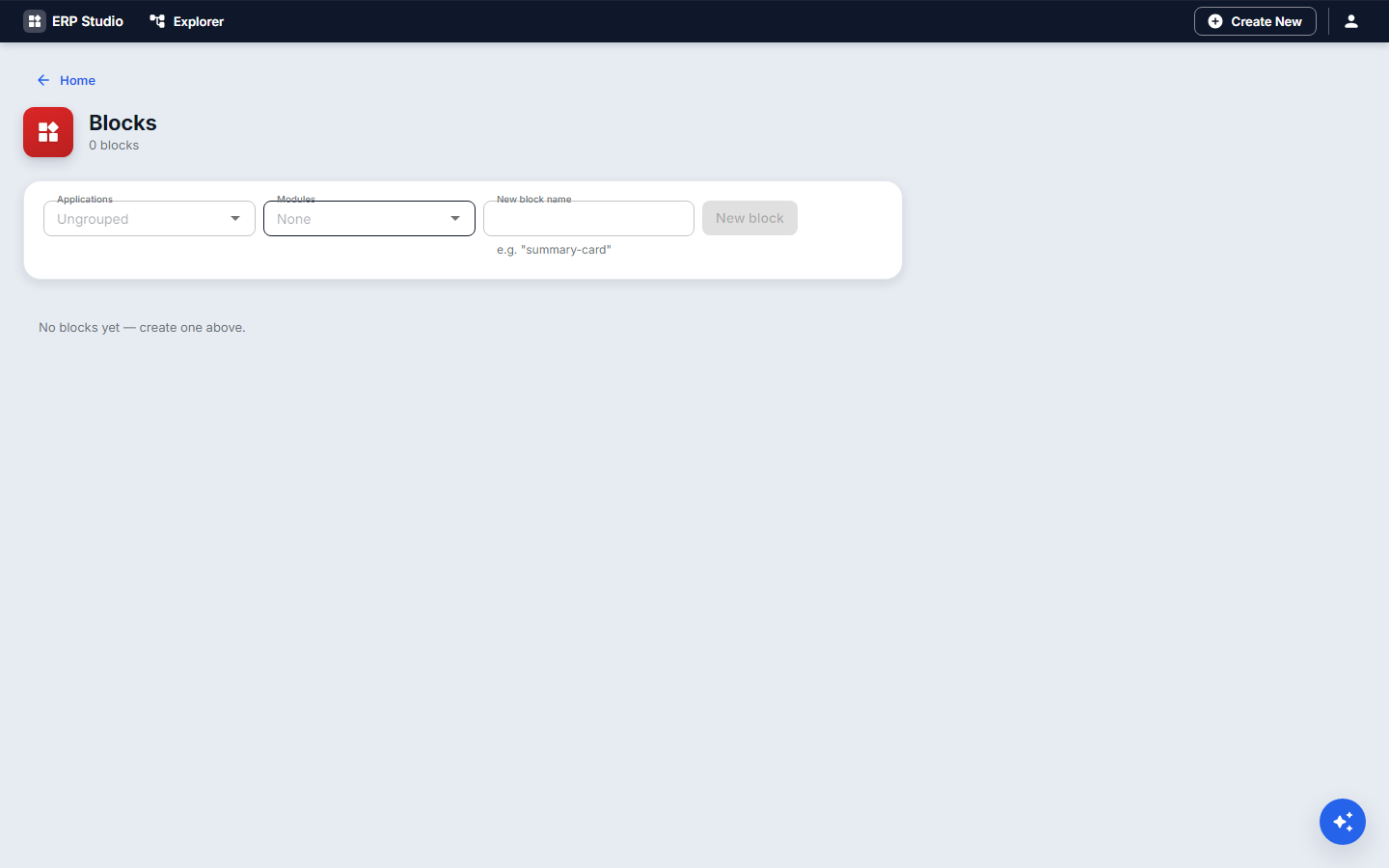
- Blocks, New
loan-status-card. - Lay out a text, a text and a badge block on the canvas.
- Expose
item,borrower,dueandstatusas properties; set defaults. - Make the badge color depend on
statususing an expression. - Publish (version 1.0.0).
- On the Loans page, drop Loan status card from the palette and bind its properties.
- Later, change the block and publish 1.1.0; pages pick up the new version.
Check it worked
The card renders in the page preview with your data and the right color.
Common mistakes
- Exposing every internal setting as a property: keep the surface small.
- Editing a shipped block: copy it first.